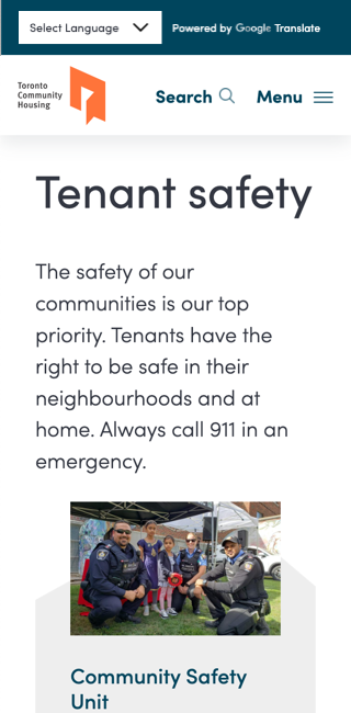
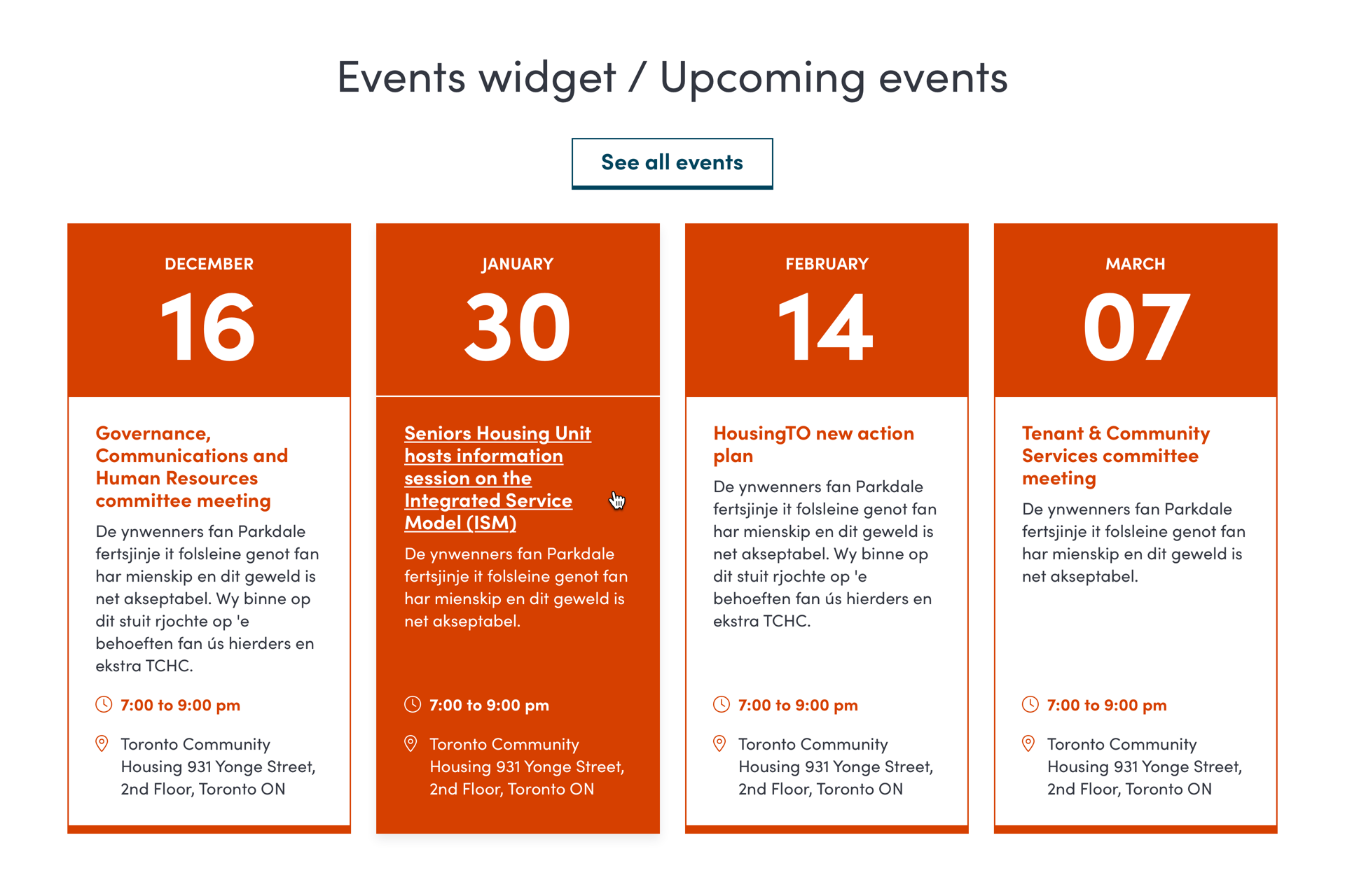
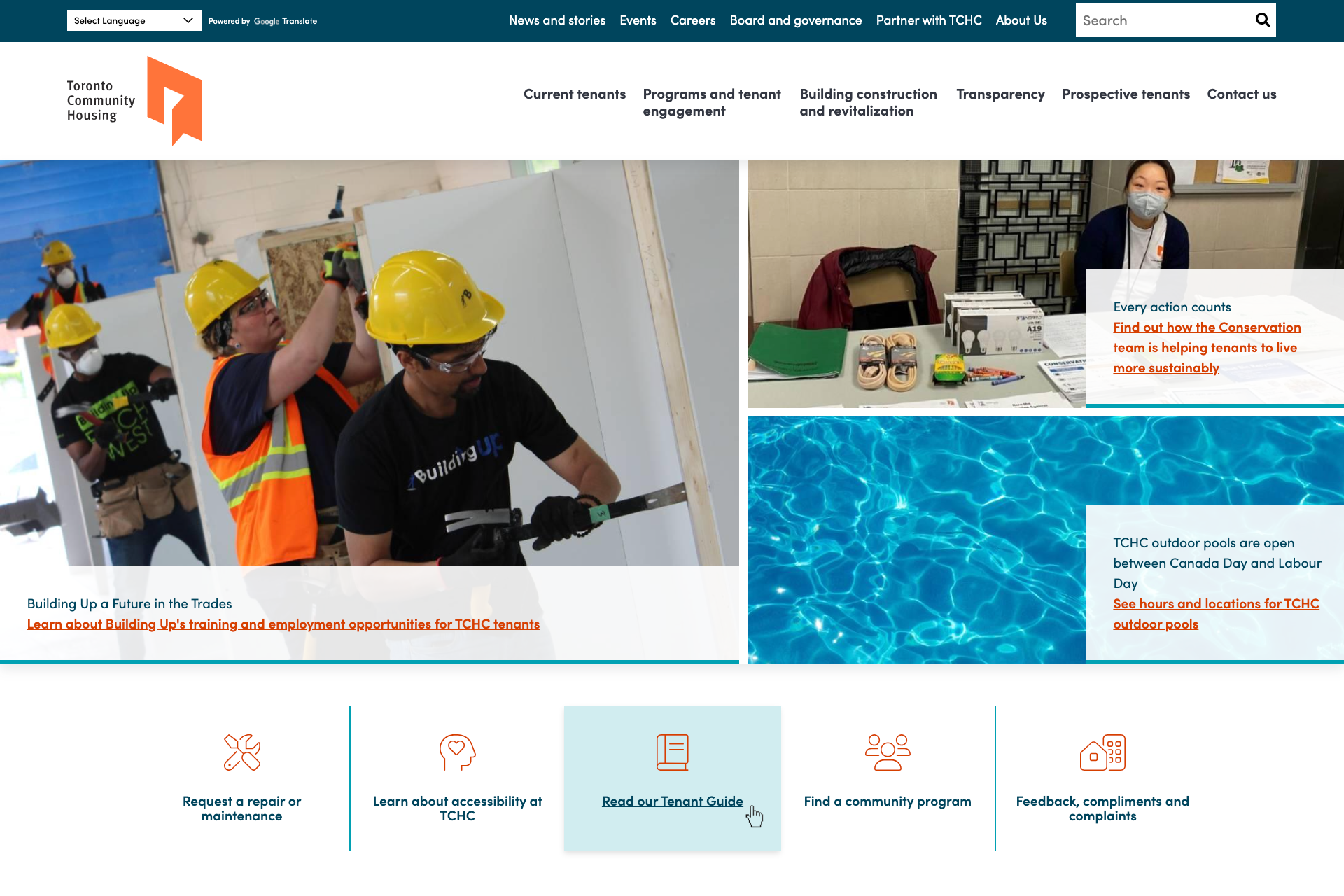
The Toronto Community Housing Corporation (TCHC) provides social housing in Toronto, Ontario. They were seeking a website refresh due to theirs not adequately reflecting their business. The old website’s colours were dark and sparse, and they had numerous landing pages linked to each other, which sent their users on circular paths while trying to find relevant information.
When I joined the project, the content strategist had already created a much more streamlined flow of content, and the fellow designer had already established a visual direction that the TCHC team was very happy with.
Working from their direction, I created all of the mobile mockups, homepage mockups, and refined the desktop mockups based on final client feedback.
Once the mockups were approved, I worked closely with the front-end developer on the project team to implement them in a globally consistent way. First, we implemented a responsive 20-column grid to dictate the horizontal spacing for each component. Then, we included a baseline grid to dictate the vertical spacing for each element. And finally, we set all of the font sizes (along with the horizontal grid) to scale based on the screen width. These were all implemented in a single instance, so a handful of CSS variables hold the building blocks for every element across the website.
Credits
- Initial UI designs and art direction: Jennifer Windsor
- Front-end development: Tristan Hampton
- 20-column framework: Frederick Brummer


